Dining Room Refresh
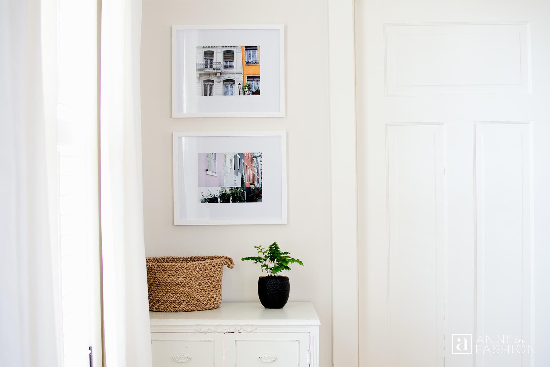
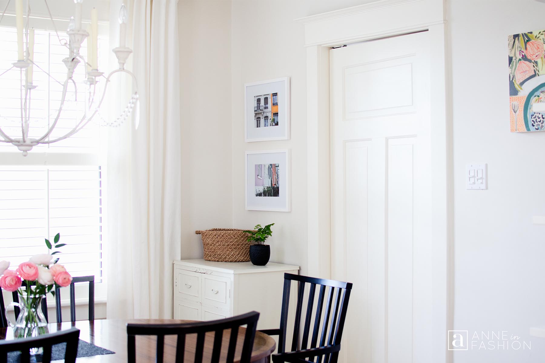
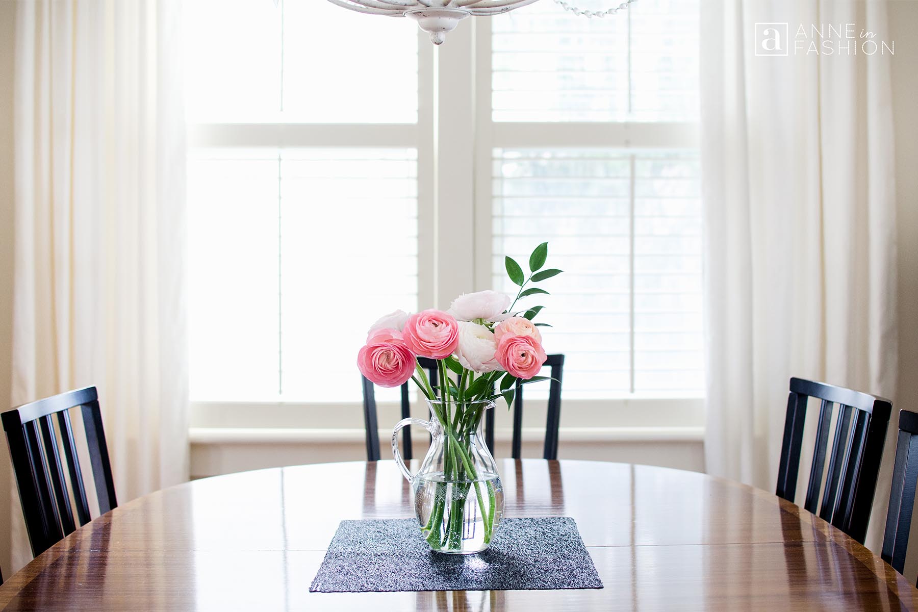
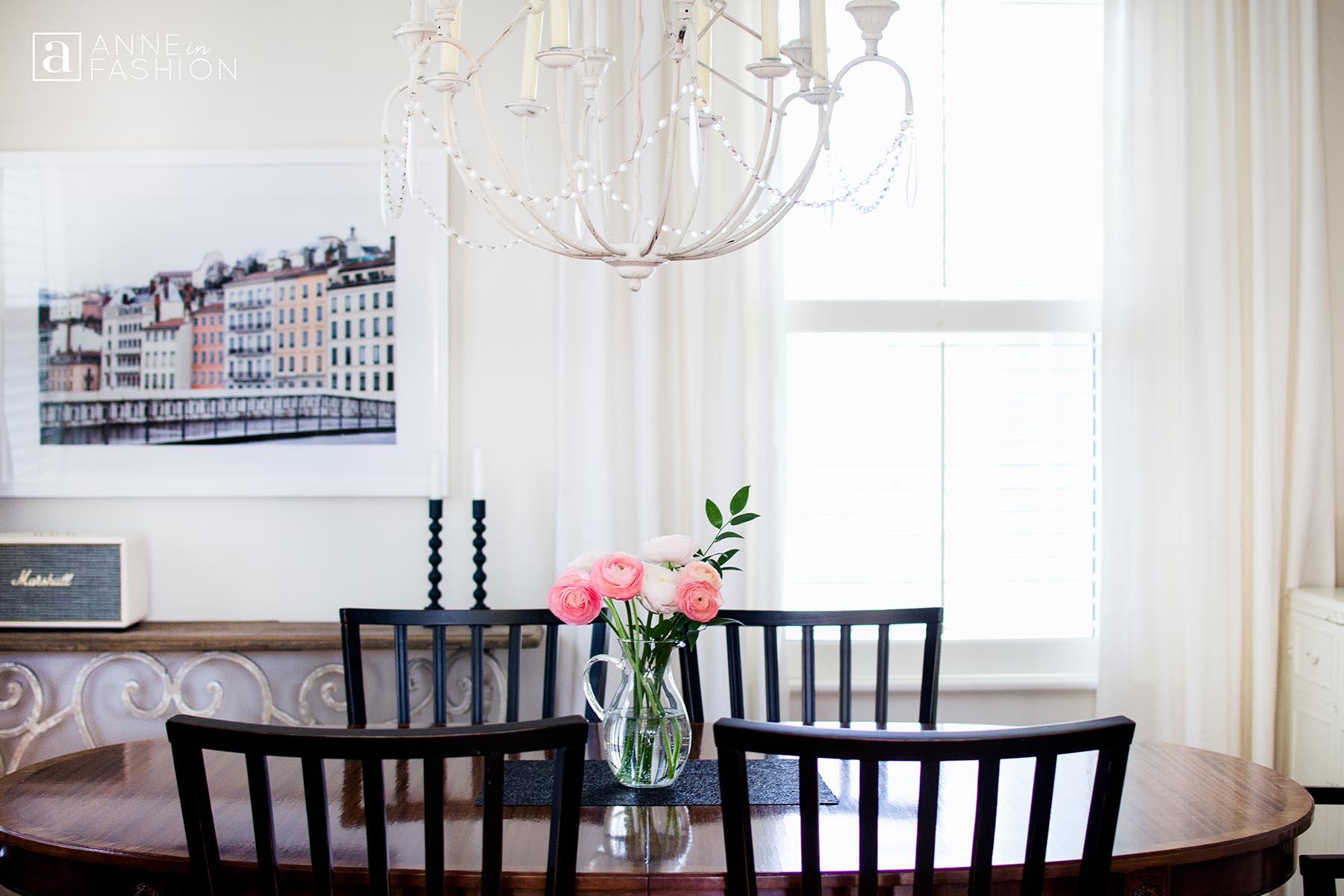

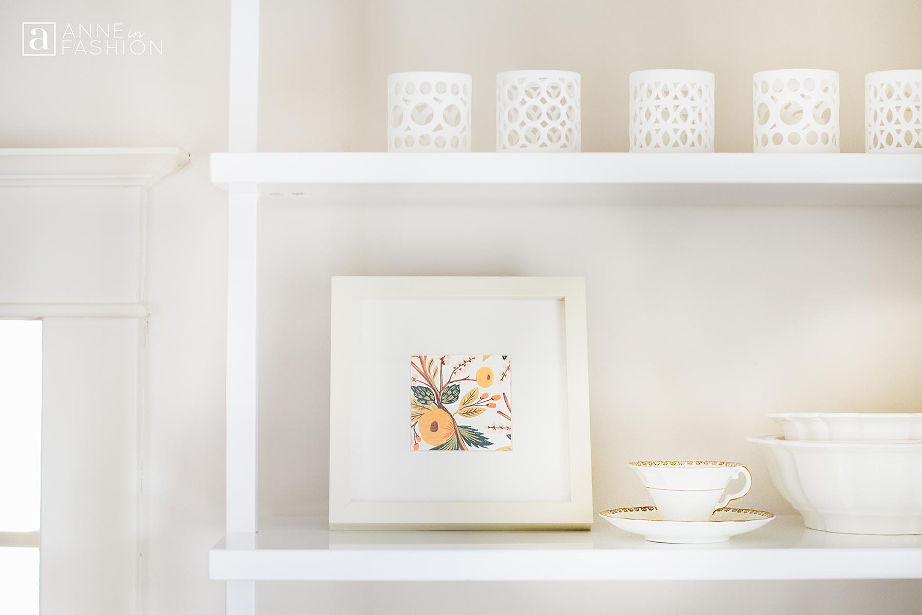
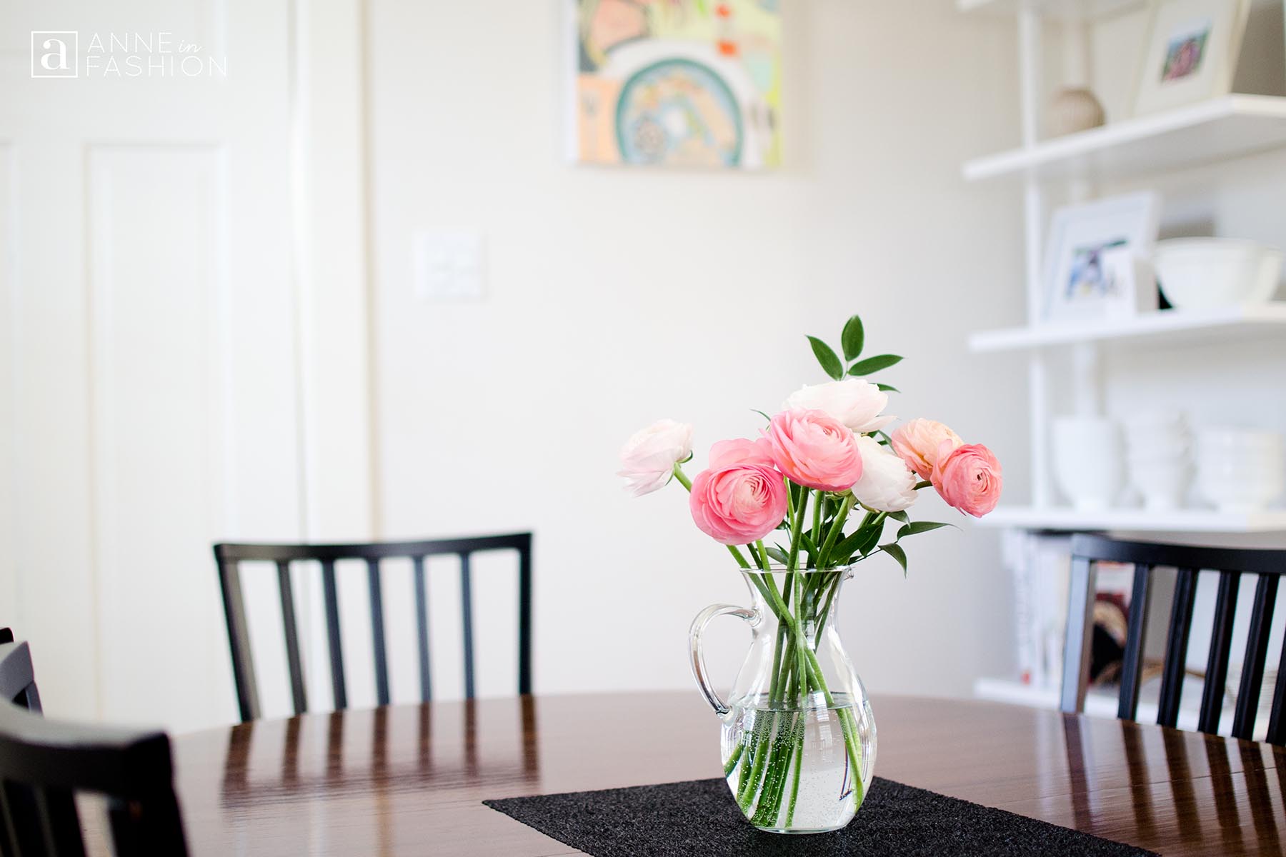
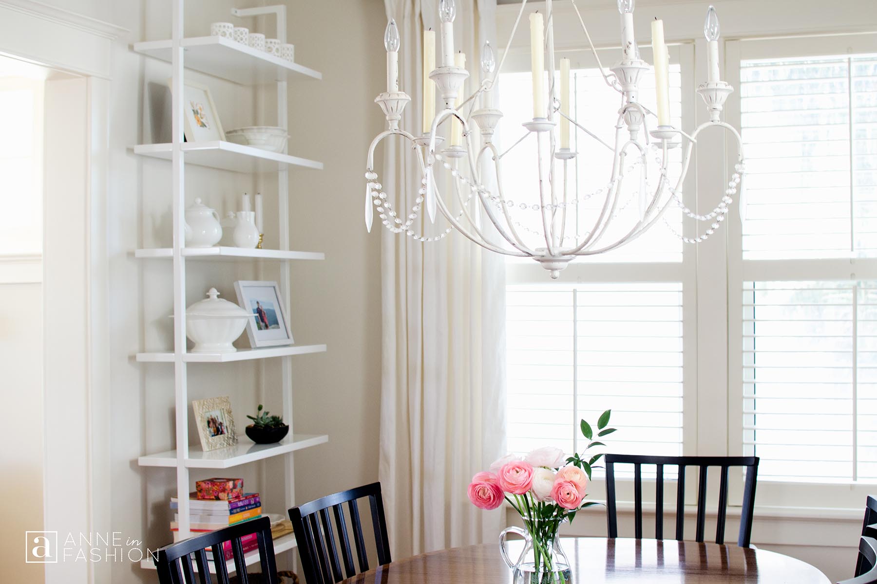
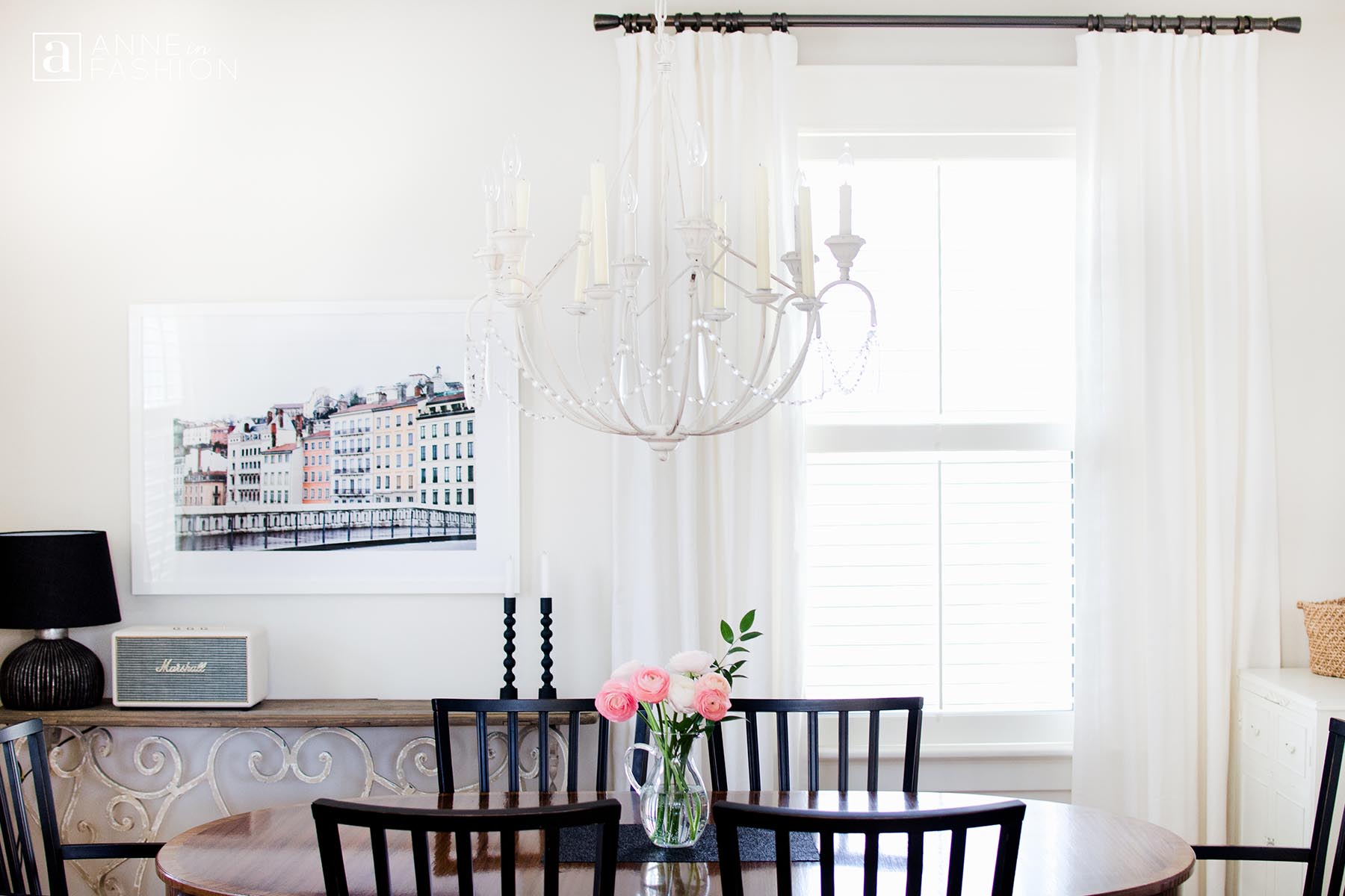
The dining room has evolved over time and we’ve made a few key updates to the look lately. We have swapped out the slipcovered upholstered chairs for some black painted wood versions which adds more edge and starkness to the overall look. Black accents also were added to anchor the scheme with the new textured lamp, graphic matte taper candle holders, planters and placemats.
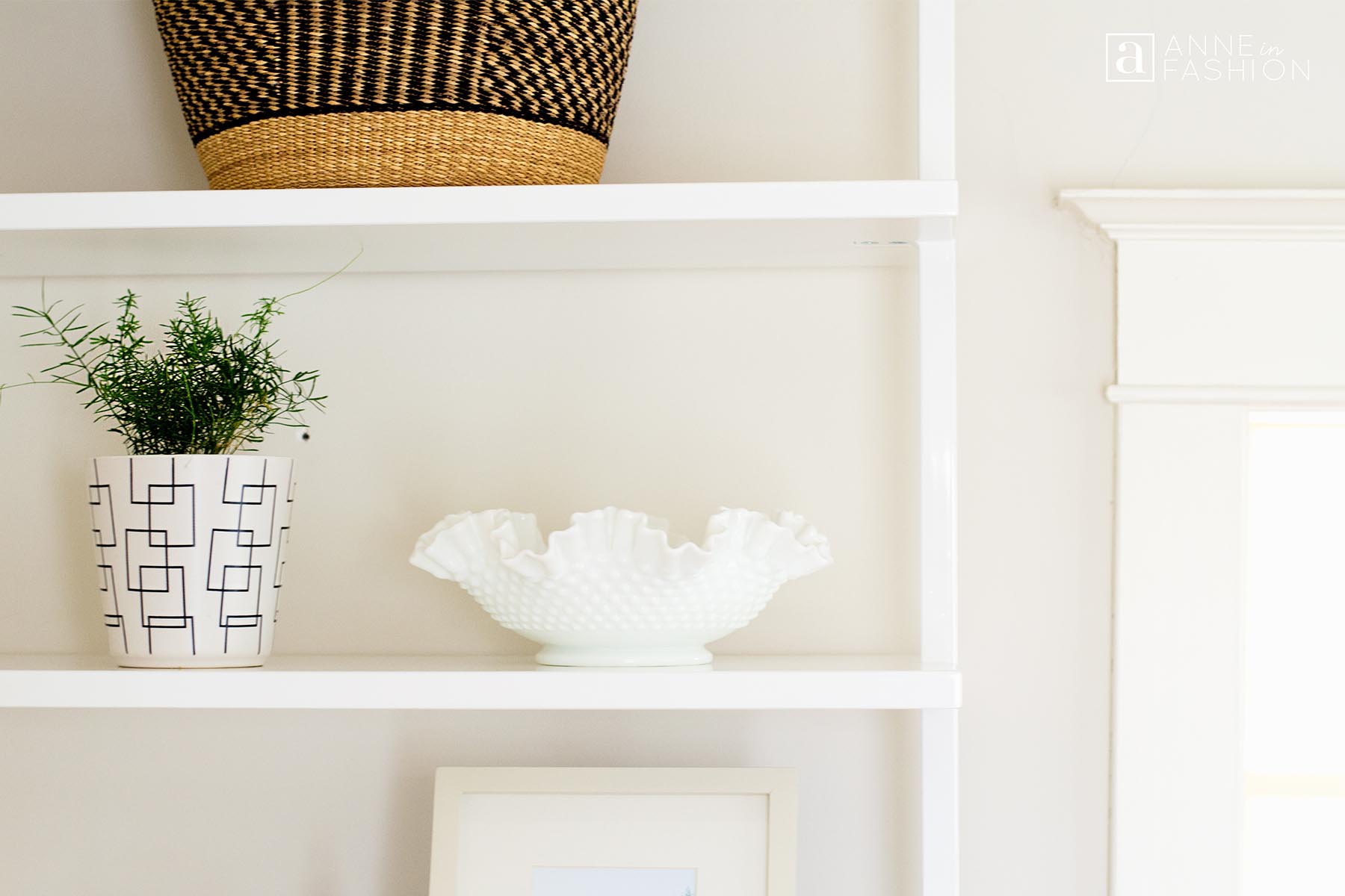
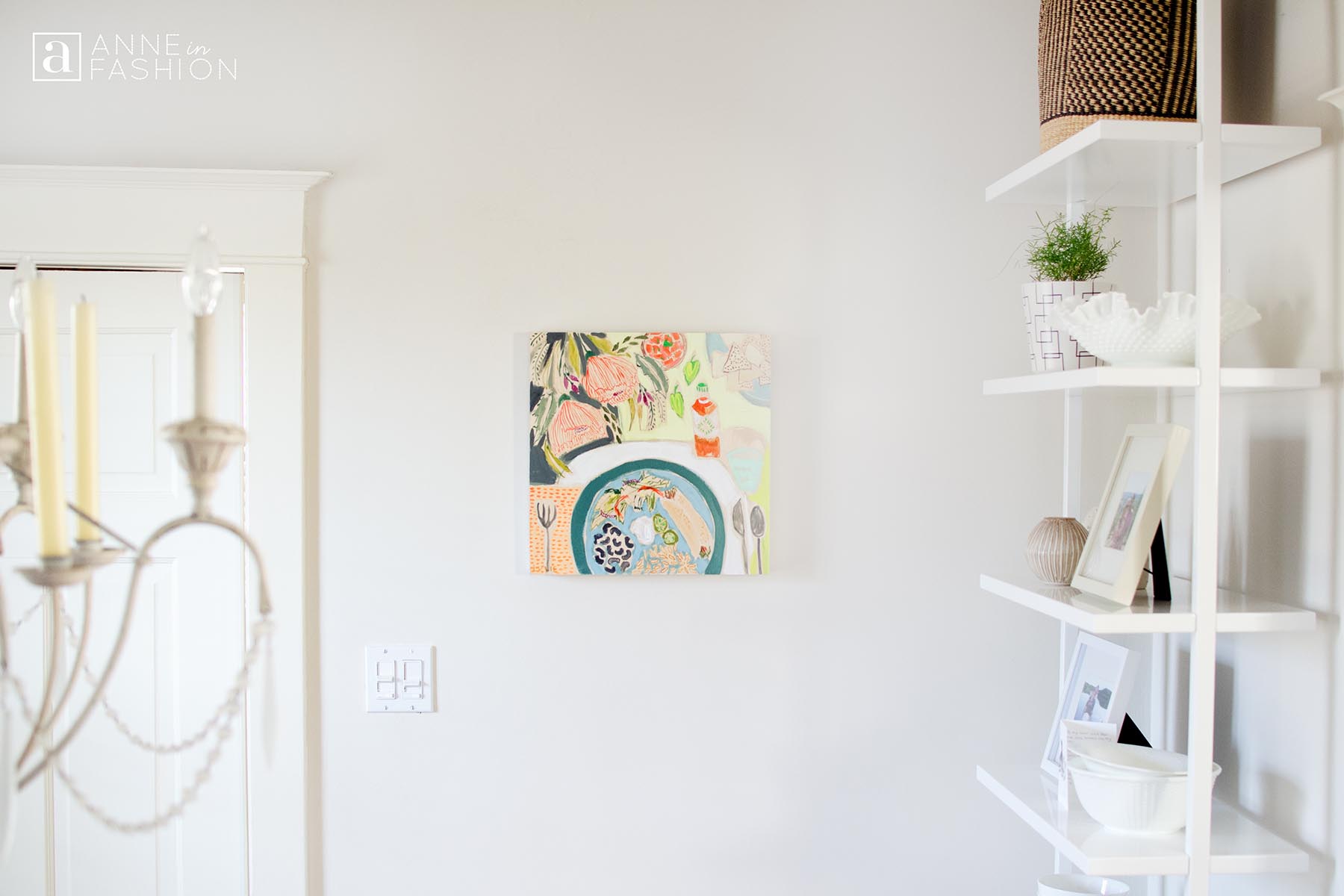
A major upgrade was replacing our inexpensive bookcases on each side of the doorway with the glossy white minimal ladder style shelving. The pristine look of these units is very striking and accentuates the height of the room’s ceiling. I love the way these shelves float away from the wall in their design. The open shelving adds to the airiness of the room and opens the area up in comparison to the old closed units with bottom cupboards that we had previously.
One of the most meaningful changes in the room was to hang one of our printed photographs from a special trip we took to Lyon, France. A glossy white frame to match the new shelving units along with a double white mat create a simple presentation so the image and colour are the focus. More photos from our trip to Lyon, France can be found in the series Wintertime in Lovely Lyon, France. More of our travel photography is printed and displayed in the room along with our tablescape painting from a favourite artist, Lulie Wallace.
The posts Tea for Two In the Dining Room and Simple and Fresh Holiday Dining Room show some of the older look that was updated.



Read recent articles
Inspiration for Unique Sandy Color Design
The Best Hair Style In The Summer 2018
How to Decorate: The New Design Projects
Studio + Library Workspace